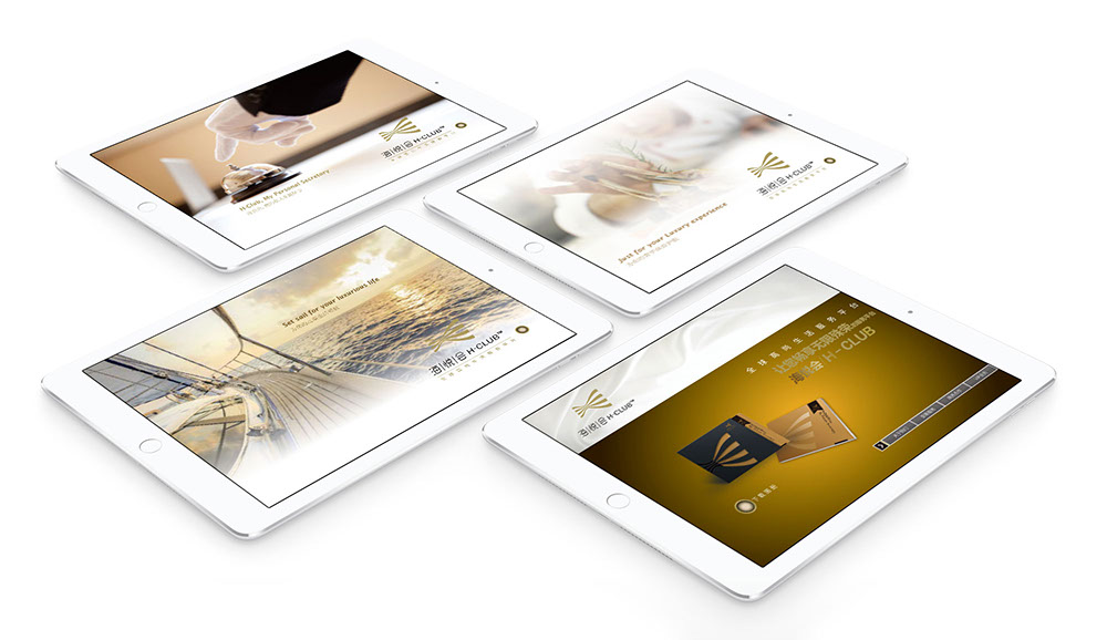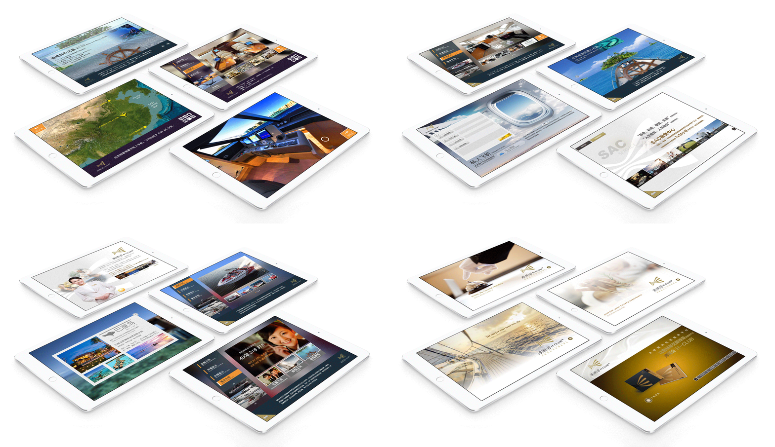
ICBC H-CLUB™ iPad App (Bank Promo App on iOS)
This application provides a convenient way to book appointments at premium restaurants, hotels, villas, golf courses, yacht services, and private aircraft, as well as access premium services such as gyms, karaoke, nail salons, hospitals, tailors, car rental services, bakeries, and florists. All businesses are carefully curated by H-Club of the Industrial and Commercial Bank of China (ICBC), China's leading provider of luxury services and products.
Originally, the app's information architecture was poorly structured, resulting in a confusing user interface and experience due to both inadequate visual design and illogical navigation hierarchy that left users disoriented.
Fortunately, H-Club engaged our team to redesign the entire UI/UX before it was too late. We began by restructuring the information architecture to clarify and simplify all sections and functions. We then optimized the experience for key user scenarios such as detailed keyword searching, location-based browsing with map integration, and casual exploration. Finally, we redesigned the visual style to reflect current design trends with flat graphics, thin typography, and the “frosted glass” blur effect for backgrounds. These improvements significantly enhanced the user interface and experience design.
After numerous meetings, consultations, and iterations, H-Club not only achieved their vision of an ideal app, but also gained valuable insights into user interface and experience design.

Continue to explore more
Apps


