Copyright © 2016 KKTV Co., Ltd. All Rights Reserved.
Logotype
Also known as “wordmark”. Different from “logomark”.
A distinct text-only typographic treatment of company name.

——————————————————————————————————————————————————————————————————————————————
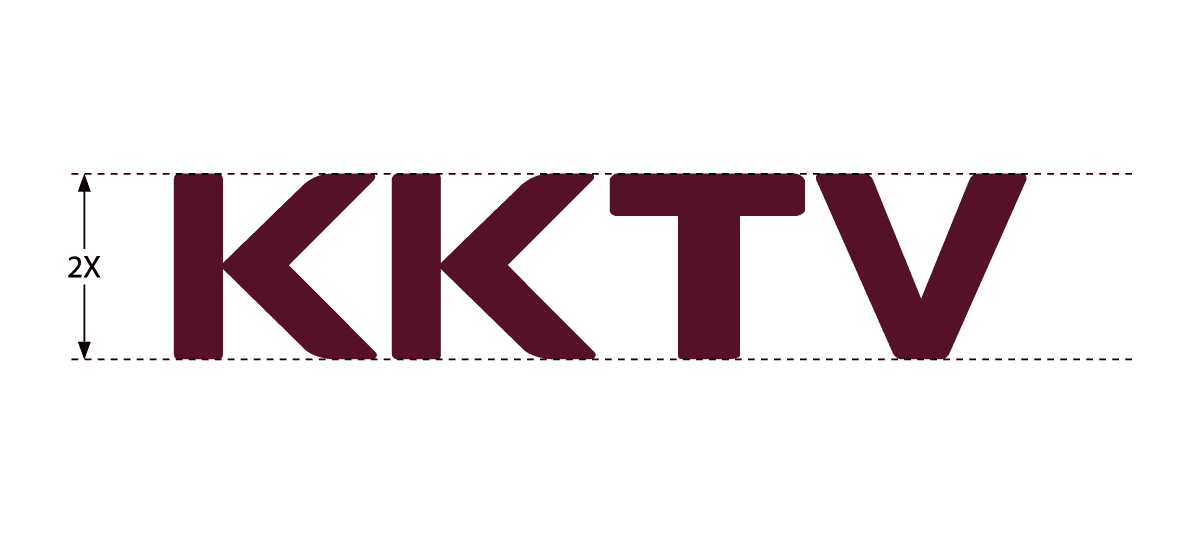
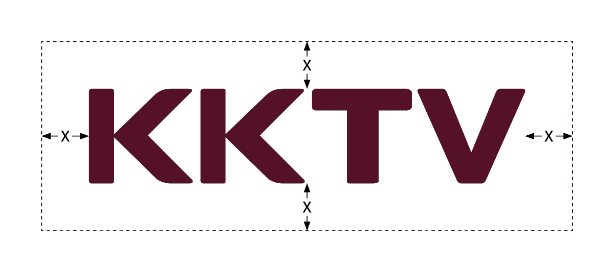
Define The Safty Frame
Step 1
Assume that “2X” is the height of the whole logotype.
Step 2
Expand each side by “X” to create the safty frame.
——————————————————————————————————————————————————————————————————————————————
Do’s and Don’ts
Keep clean within the safty frame
All other designs should not be placed within the safty frame.
Only “background” is not subject to this limit.


Use “Primary Wine” or “Black” on undertone background
Make sure the color is correct. Use “Black” only in K printing.
Use “White” on dark or black background
Do not use “Primary Wine” or “Black”.
Use “White” on colorful or moving background
Do not use “Primary Wine” or “Black”, unless the colorful or moving background is mostly undertone.


Keep the original shape and color
Do not transform, or use different colors.